Sawyer Rebind Revisited
Back in December, Matt Morales shared the results of one of his rebinding projects with us -- a wide-margin ESV cut down and rebound by Paul Sawyer. Not long ago, Matt sent me the Bible and asked for a second opinion. I snapped these photos and would like to share them along with some observations that might help others looking to undertake a similar project. (You can click on each image to see a larger version at Flickr.)
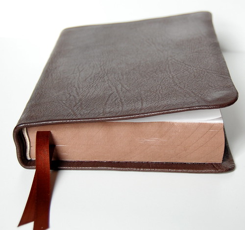
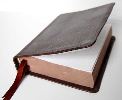
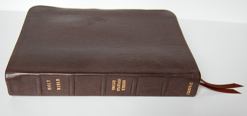
The photo above illustrates the best and worst of this rebinding project all at once. The best? That magnificent Nigerian goatskin cover, with its beautiful deep brown finish and attractive grain. The worst? The stiffness of the binding, which is exacerbated by the cover's thickness. Instead of wrapping around the text block like a shell -- one of the trademarks of semi- and full-yapp cover edges, this one projects stiffly at a roughly 45 degree angle, no matter which side is uppermost.
Above, another angle on the projecting cover.
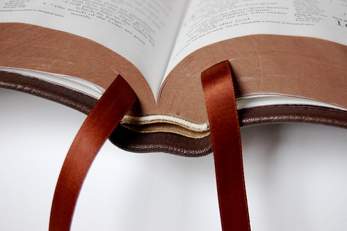
The image above might give some insight into the reason the spine is so thick. As you can see, it doesn't open flat. Instead, for the first quarter-inch or so, the text block holds together, a near-solid unit, before cascading out. My little Compact ESV from LeatherBibles.com did the same thing. I believe the reason is the way the binding -- originally glued -- was sewn. It seems that instead of sewing the signatures individually, the needle was passed side-to-side through them all. As a result, the stitching prevents them from opening completely. The reason the sewing is done this way, I suspect, is that the original adhesive binding sliced the joins of each signature away, so that every page is flat against the spine for gluing. Look closely at the picture and you'll have a hard time identifying individual signatures. Instead, the pages seem to dead-end into the spine.
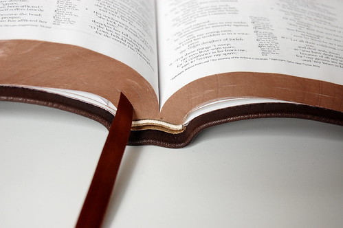
Another view (above) with the ribbon moved so you can see the way the spine holds together. As a result, when the Bible is opened flat on a table, it has a tendency to see-saw a bit from one side to the other.
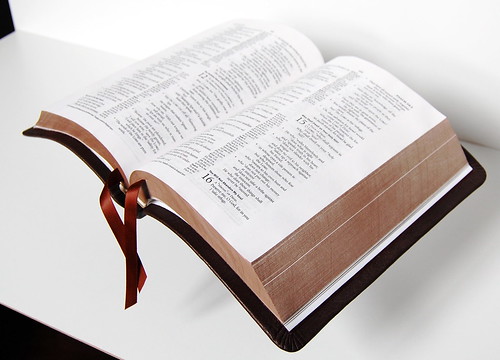
When I open the Bible with the spine supported, the sides extend roughly parallel instead of plunging down on either side. The impression is one of stiffness, not limpness. If the goatskin cover were thinner, like the ones from Allan's or Cambridge, you'd see more flexibility, though the spine is the real drawback. Over time, I could see the thick cover growing more supple with use, but the spine doesn't seem to open up. Perhaps it will, but I'm doubtful.
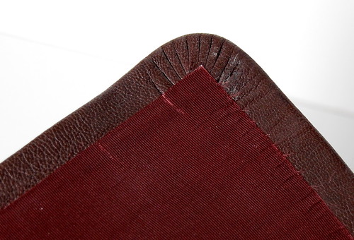
Instead of a leather lining, this one uses watered silk. The effect is quite elegant, and the deep burgundy silk goes nicely with the brown cover. Unfortunately, the silk seems to fray easily, so that little threads are visible all along the edge. (You may have to click the image and view it at the original size to make them out.)
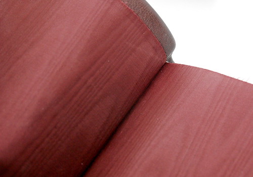
Again, you can see the frayed edges. The effect of the silk, though, is unique. I'd prefer a leather-lining, since the silk seems more compatible with a hardback than what's supposed to be a limp binding. But to each his own.
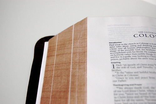
Instead of gilded edges, the pages have an attractive brown treatment I really like. The look is similar to art-gilt but entirely non-reflective. It also has a "grain" of its own, as you can see when the pages are fanned out.
My overall impression? The project is impressive, but there's room for improvement. The color scheme is magnificent: the brown goat, the brown page edges, the deep burgundy silk linking, the beautiful copper-brown ribbons. In person, it's elegant without being flashy. Understated. Where the project disappoints is the feel. The way the spine is sewn prevents easy opening. This is why, whenever possible, it's imperative to start with a sewn binding. For example, if you're one of the people thinking of rebinding a Personal Reference ESV, springing for the genuine leather edition with the sewn binding will ensure that the signatures are still intact when it comes time to re-sewn them.
If you ask me, getting the binding right would "solve" the rest of the project's problems. The thickness of the goatskin is a drawback, but not everyone prefers a super-limp cover. With time and use, this one might age magnificently, growing just supple enough to please someone who prefers a little more stiffness in his leather cover. For my taste, though, the leather needs to be thinner and the the cover should be leather-lined, as well.
The workmanship seems to have more "polish" than what I've seen from some other rebinders -- not as clean as an Allan's binding, but a little nicer in terms of fit and finish than what I've seen (for example) from Mechling. Of course, there's a price difference to consider, too.
Hopefully these photos will let you make up your own mind. Matt has received lots of questions about this project, and I'm sure he'd be happy to answer any posed here.

