Spanish Bible: "Dios Habla Hoy," Rebound by Abba Bibles
We've already seen three of Cristian Frano's editions bound by Abba Bible, and here comes the fourth and final one. It's the Bible Cristian uses for preaching, study and everyday reading. As I said before, in each of these posts, I'll begin with Cristian's description, then share the photos. The captions are written by me. So with no further ado:
Spanish Bible "Dios Habla Hoy"
This Bible is the "Dios Habla Hoy" translation (like the CEV in English), made by the United Bible Societies directly from the Hebrew, Aramaic and Greek. This is the best Bible I know to share the Word of God with non-believers, because it's easy to understand and is very fine in its language.
March was my birthday month, so I gave myself a gift! I sent a copy to Mexico (yes, from Argentina...!), and they rebound it for me in my favourite color: blue! I love this Bible, and nowadays it is my primary Bible, which I'm using in preaching ministry, study and everyday reading.
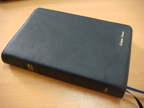
It's Smyth-sewn and bound in blue calfskin with leather linings, red under gold page edges, and two ribbon markers. My name is embossed in gold on the cover.
-- Cristian Franco
 Above: It's always risky to judge from photos alone, but this one looks especially soft to the touch.

Above: An attractive two-column layout.

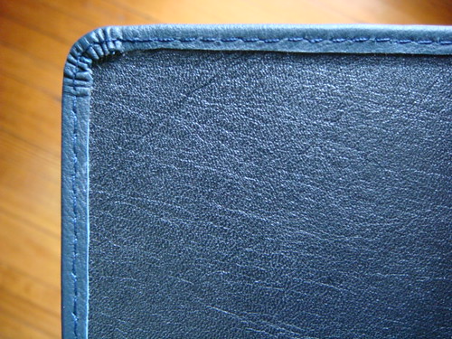
Above: Close-up of the name embossing and the stitched edge.

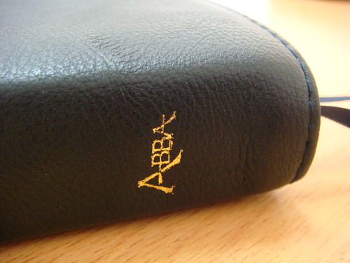
Above: Detail of the spine. This gives you a good look at the grain up close.

Above: Another close-up of the spine. Note the slightly raised band.

Above: A trim, clean look. Here, the stitching on the cover edge matches, which gives a more refined impression than the contrast stitch (much as I like the latter).

Above: Yoga. The blue ribbons are quite nice, too, aren't they?

Above: A glimpse inside. Here, you can make out the blue coloring quite well.

Above: If this isn't enough to make you want a blue calfskin Bible...

Above: The leather lining in total. Very clean, polished work -- which is how all rebinding projects should look.

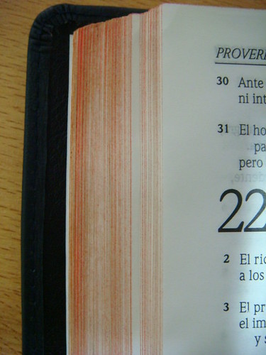
Above: The page edges up close, looking gold.

Above: From above, all fanned out, the page edges look red.

Above: A little red, a little gold, and a beautifully trim cover.

Above: One last look. Is it any wonder Cristian is using this edition as his primary? It's beautiful.
Please join me in thanking Cristian for sharing his amazing rebinding projects with us. Is it any wonder Abba Bibles is where the big publishers go for high end editions? Tempted to send them something? By all means do -- and be sure to share the results with the rest of us!


