Glimpse: The Great News NIV New Testament
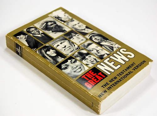
A lot of thrift store bookshelves are downright depressing: rows of cracked spines and garish mass-market paperbacks from yesteryear. But I came across this little volume in one, and my spirits were buoyed. It's the NIV New Testament in a format obviously designed for outreach (you can tell because of all the clip-art people, who send the subliminal message that "this book is for everyone").

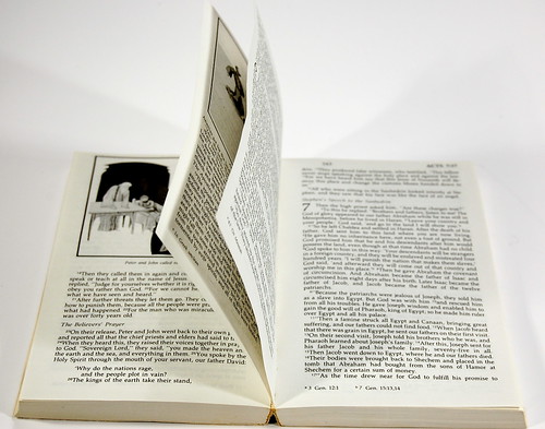
Yesterday's attempts at relevance often fail to stand the test of time, but when I opened this paperback, a wave of nostalgia overwhelmed me. It's a single column setting, as you can see:
What's more, it's illustrated:
Now why do you suppose the text in this edition is made to look like the inside of any other book? That's easy. The designers wanted it to look accessible ... readable. Who wouldn't want that, right? And yet, most editions of the Bible get this wrong. They aren't designed for reading; they're designed for looking up verses. In the church, we're so accustomed to this arrangement -- it's been like this for five hundred years or so, after all -- that it seems natural to us. But if they put out a new edition of The Shack with super-small, double-column type, dividing the text up into numbered phrases and starting a new paragraph for each one, that quick read might not be so quick anymore. He who has ears to hear, let him hear.


