Inside the Schuyler Quentel, Crossway Heritage Giveaway, and "Why Single Column?": Links
 A couple of links this Friday about two very different but interesting Bible editions:
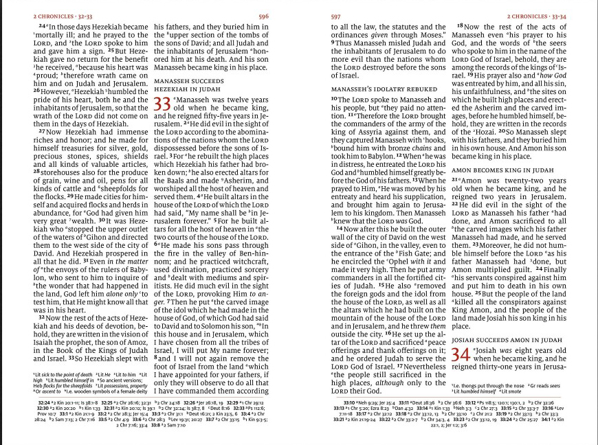
"Schuyler Quentel Reference Bible NASB: Reflections on the Groundbreaking Design of One of the Premier Luxury Bibles on the Market Today." Andreas Krautwald, art director at 2Krogh (of Design Bible fame), has written an in-depth post about the design brief for Schuyler's new Quentel Reference NASB, the challenges involved, and how the 2Krogh team solved them. We don't often hear about behind-the-scenes thinking that goes into Bible design, so this is a welcome insight. I had the pleasure of spending time with Klaus Krogh and Thomas Silkjaer several years ago and could not be happier to see this 2Krogh + Schuyler collaboration materialize!
"Introducing the Single Column Heritage Bible (with a giveaway!)" Crossway's new Single Column Heritage Bible features a lovely single column setting without cross-references, which makes for an excellent reading experience. I will be writing about the Heritage on BDB shortly. In the meantime, Crossway is giving away two copies of the calfskin edition. All you have to do is follow the link and leave a comment describing your ideal Bible. (I had a look, and at least some of these ideal Bibles seem already to exist.)
And if you haven't read it in awhile, here is the 2008 BDB post the Crossway blog links to:
"Why Paragraphs? Why Single Column?" It would be hard to read BDB for long without realizing how passionate I am about paragraphed, single column text settings. But why? This post distills the essence of why these features seem essential to me in reader-friendly Bibles.
