R. L. Allan NASB Single Column Reference (NASB SCR) in Black Highland Goatskin
Although the NASB Single Column Reference from R. L. Allan, available in black, blue, and brown highland goatskin, features a single column setting, instead of paragraphed text the lines are divided verse-by-verse, with generous outer margins to display references. This kind of hybrid design, a mix of old school (verse-by-verse) and new (single column), has never been much to my taste, but it enjoys a very strong following among preachers who exposit verse by verse, those who have a hard time finding their place in paragraphed text, and readers who simply appreciate the way each verse stands out without sacrificing readability as much as double column verse-by-verse settings do. The design isn't as fresh as similar offerings from Crossway. Even so, if you're a fan of the NASB and this style of Bible, I think you'll appreciate what the Allan NASB SCR has to offer.
DESIGN NOTES & PAPER
R. L. Allan has rebound the Lockman Foundation's popular Side Column Reference Edition. The 6" x 9" x 1.5" form factor makes the NASB SCR a bit of a brick. In return for its bulk, though, you get a spacious layout and generous 11 pt. type. If you preach from the NASB one verse at a time, a design like this one might just be your best friend.
One thing I'm not a fan of: translators deciding to use non-standard forms of typographical emphasis. Notice verse 44 above. The quotation is in caps instead of quotation marks. That would be appropriate if the text were citing a phrase carved in stone or written on a sign, but the NASB uses this irregular emphasis to denote an Old Testament quotation. A number of translations do this sort of thing, usually with keys in the front matter explaining what the strange usages signify. This is not okay. It makes about as much sense to me as setting the OT in a Hebrew-style font and the NT in a Greek-style font. Good design should be transparent. This calls attention to itself, and demands that readers learn a different set of skills for this book than for others.
That's the last rant I'm going to include in this post, I promise. The sin is not exclusive to the NASB, and isn't the fault of R. L. Allan, who sourced this book block from the Lockman Foundation. Maybe someone from the Foundation will see this and make a note that in some future edition usage will be brought into line with standard English punctuation.
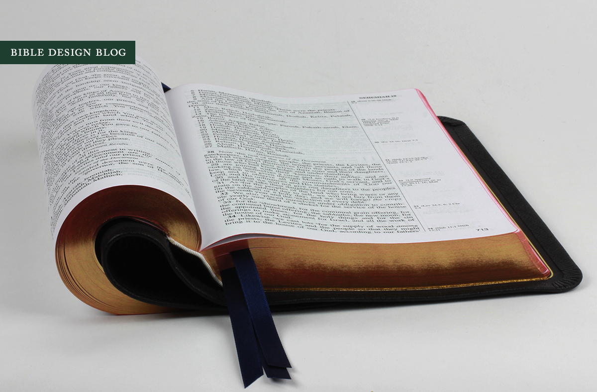
In the meantime, the NASB SCR gives me an opportunity to point out something interesting. Look at the poetry in the photo above. We all know that double column settings play havoc with poetry, forcing all kinds of bizarre, too-short line breaks. If you combine verse-by-verse formatting with double column layout, you get a much worse result -- which might be why those old KJVs didn't versify the poetry the way contemporary translations do. The question is, which is worse? The double column or the verse-by-verse. This photo makes it clear that the narrow columns are the culprit. Apart from some awkward formatting in verse 13-14, this poetry looks quite good, don't you think?
What is perhaps not as good: the paper. This Lockman book block is printed in China, and while that's not the blanket condemnation some people would like to believe -- there are some excellent Bibles being printed and bound there -- in this case the paper lets the edition down, especially in the eyes of Lockman fans familiar with the opacity of earlier editions of the Side Column Reference Edition. As you can see, the pages have a bit of a grey hue, line-matching is inconsistent, and opacity could be better. ("You mean much better!" cry the Lockman collectors.) Is the paper a deal breaker? If you have one of the older Side Column References and you're looking for something comparable, perhaps so. But if today's Lockman editions are your benchmark, no.
BINDING
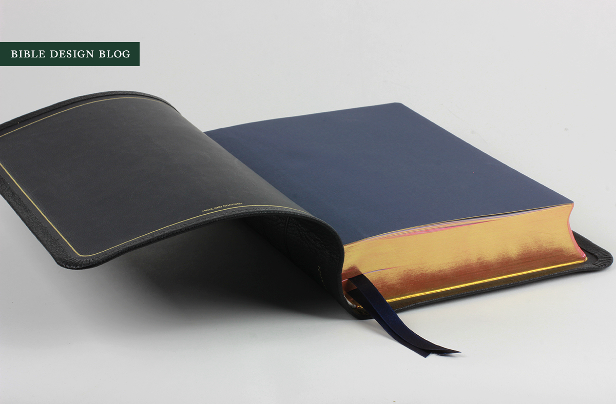
The binding is everything when you're talking about R. L. Allan. You can find the book blocks elsewhere, but the bindings are second to none. The NASB SCR is no exception. The black highland goatskin cover pictured here is the safest of options. I would steer you toward either the brown or the blue unless you're one of those people for whom a Bible ought always to be black. The semi-yapp cover's overlapping edges add a little extra width and height to the book's footprint, but they're a nice classic touch that complements the art-gilt pages and the thick market ribbons.
Because it has an edge-lined binding, the NASB SCR is quite limp, as you can see:
You'll never need to contort your Bible in this way, but the photos give you an idea of how the Bible might feel in your hand. A more practical advantage of a limp binding in a larger edition like this is that, when hand-holding the Bible to read, you can curl one of the sides to minimize the bulk. As long as you don't put stress on the spine, you're good to go.
The black edition of the NASB SCR comes with three navy ribbons, an essential if you're using a reading plan, and has blue endpapers. In ordinary light they are dark enough to appear black, matching the cover's black lining, but under the bright lights the indigo comes out.
One thing I have to say about black goatskin in general is that, while it may not be the most exciting material to photograph, it displays leather grain exceptionally well.
CONCLUSIONS
Every translation has its ardent followers, each with their own tale of woe. Until recently if you liked the KJV you had to put up with archaic layouts. NRSV readers look back fondly on the days when they could find editions bound in something as exotic as 'genuine leather.' The NKJV suffers from a similar lack of support, and I won't even get into the complex feelings of those who cherish the various editions of the NIV. For the NASB crowd in recent years there's been a "by the rivers of Babylon" vibe. It's not that there aren't some excellent NASBs out there; it's that longtime users can't help thinking of the bygone good ol' days of Lockman quality.
The thing is, the good ol' days for the NASB are right now. If you want a fantastic hand-sized, reader-friendly reference edition, the Cambridge Clarion NASB is a superb choice. For a beautiful, large-print reference edition designed from the ground up with quality in mind, there's the Schuyler Quentel NASB -- not to mention the Allan Readers Edition (another Jongbloed-printed large print reference Bible). While the Side Column Reference Edition doesn't measure up to the Clarion in terms of design, or to the Quentel or Allan Readers Edition in terms of book block quality, the unique format mated with this lovely Allan binding adds another great option to the contemporary line-up. It's a very specialized sort of layout ... but if you're one of those readers a single-column, verse-by-verse format speaks to, this is a nice edition to have.


