The KJV Schuyler Reference Bible in Antique Mahogany Goatskin
 I forget sometimes how difficult the language of the KJV can be. The Mardersteig New Testament was open on my library stand, and I pointed it out to a visitor, who promptly skimmed the page and declared, "That's tough to read." My foray into Bible design began many years ago with the hope that good typography and layout could make the archaic Authorized Version more accessible, and there are few editions in my collection that better exemplify the principles of classic design than the Mardersteig. Still, there's a limit to what design can do. Some things are always going to be challenging. In the case of the KJV, which remains the Bible to most English speakers, certainly the translation that has shaped our idea of what Scripture is meant to sound like, the challenge is worth it.
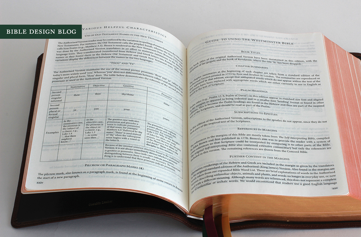
The KJV Schuyler Reference Bible takes a different approach to the problem of comprehension, sticking with pre-20th century design but incorporating features like archaic word lists and guides to thees and thous to make the job a little easier for modern day traditionalists. This is an edition of the Trinitarian Bible Society's Westminster Bible, printed and bound to exceptional standards by Jongbloed in the Netherlands. Make no mistake: it's for the old school KJV enthusiasts out there. While it concedes the evolution of language and the need for legibility make it necessary to define now-misleading words and employ modern typography, the spirit of this edition is pure eighteenth century.
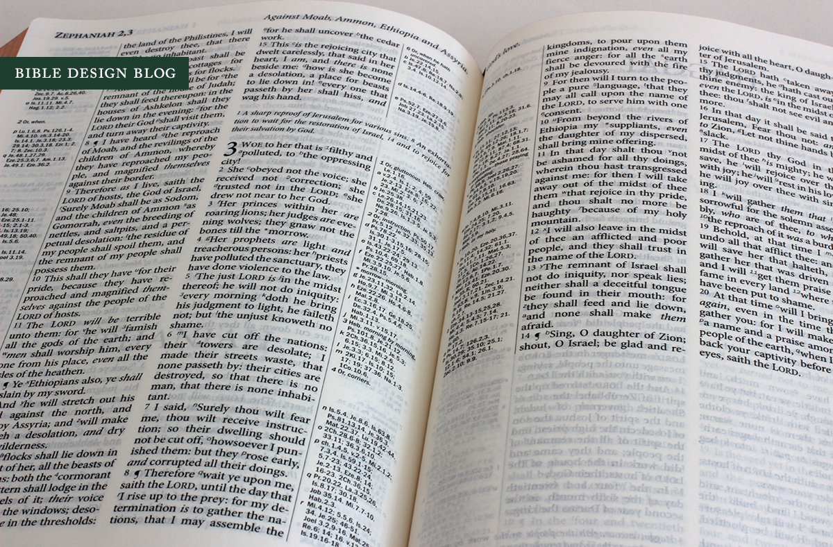
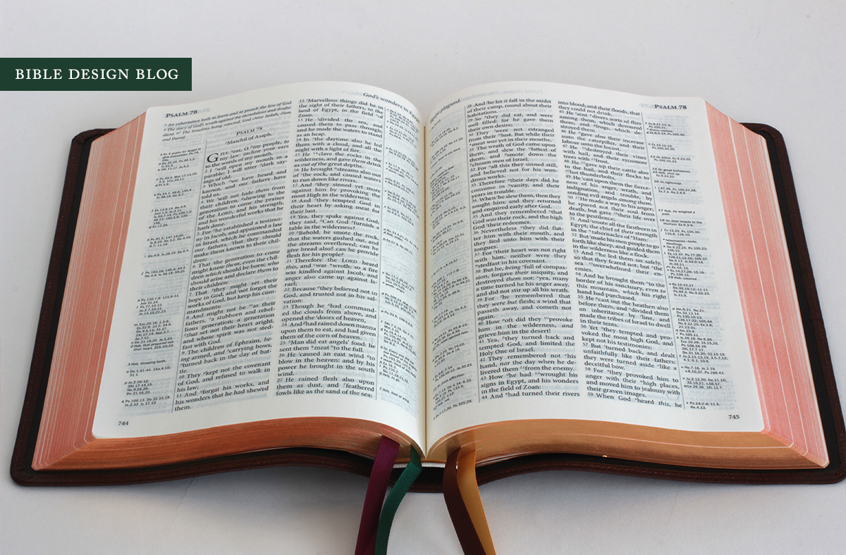
The rich feature set of the TBS Westminster Bible combines the greatest hits of the design tradition behind the classic KJV: two narrow columns of text with references to the side, chapter summaries (from 1773, with archaic words updated) that help you navigate the verse-by-verse text, running headers that orient you as you flip through the pages, and the words supplied by the translators for sense are set off in italics. The cross references are largely drawn from John Brown's 1778 Self-Interpreting Bible, supplemented by references from the Concord Bible. As the Westminster Confession of Faith puts it, "the infallible rule of interpretation of Scripture is the Scripture itself." Cross references facilitate the task of comparing related passages.
Some pitfalls of the old school reference Bible are present here: for example, the narrow justified columns require addition space between the words, sometimes stretching them noticeably. Verse-by-verse layout, while it makes individual lines quicker to find, subtly re-contextualizes them as well, changing the way we read. Verse and prose get the same visual treatment, so there's no way to tell at a glance if you're flipping through the epistles or the psalms. One lovely instance of the TBS Westminster Bible improving on the old ways without abandoning them is the decision to include a pronunciation guide in the back matter, rather than breaking up hard words syllable-by-accented-syllable in the text.
Another feature I always appreciate in a modern edition of the King James Bible is the inclusion of the preface "The Translators to the Reader," which explains the motives behind the then-new translation and the manner in which it was accomplished, answering traditionalist objections of the day to what was, after all, a government-sanctioned effort to replace the beloved but monarch-unfriendly Geneva Bible. The erudition of the translators shines. You cannot read this preface without realizing how differently they viewed their work than some of the translation's modern 'defenders' do. This is important, I think, because we have a tendency to throw out the baby with the bathwater. The KJV is hard to read -- in some places, very hard, especially if you're not accustomed to early literary styles -- which is bad enough, but then some of its loudest adherents give the impression you wouldn't want to read it even if you could. Hearing from the translators themselves makes a big difference. It might help you appreciate why people like me, who gladly recommend modern translations for their advantages, remain appalled by the thought that the KJV will be forgotten by the church, though never the world.
If you're publishing the King James Version today, you face a few challenges other translations don't have to contend with. No, I'm not talking about the seventeenth century language. I mean the fact that this translation has been in print for centuries, which means you're competing quality-wise with vintage editions that remain readily available and often use better paper and feature better bindings than what is typical now. One way to distinguish yourself is to offer something vintage editions lack. The Cambridge Clarion KJV, for example, is a classic reference edition with a major twist: readable single-column, paragraphed text. If I were introducing a new reader to the Authorized Version, the Clarion would be a far more accessible choice than a vintage KJV, which is most likely going to be an old school reference edition designed for looking things up rather than immersive reading.
The KJV Schuyler Reference Bible offers a different appeal. Yes, it's aimed at the traditionalist who wants his verse-by-verse text and his chapter summaries and his cross references. But he also wants the help with archaism, and appreciates a larger, clearer typeset on quality paper with a modern limp binding. The font size is 9.6 pt. and the paper is Schuyler's stand-by 32gsm. The Jongbloed binding is limp and quite beautiful -- really, the best of old and new. It's an unapologetic self-study tool designed for digging deep into the text without the aid of additional books or software, or anyone else's interpretative notes.
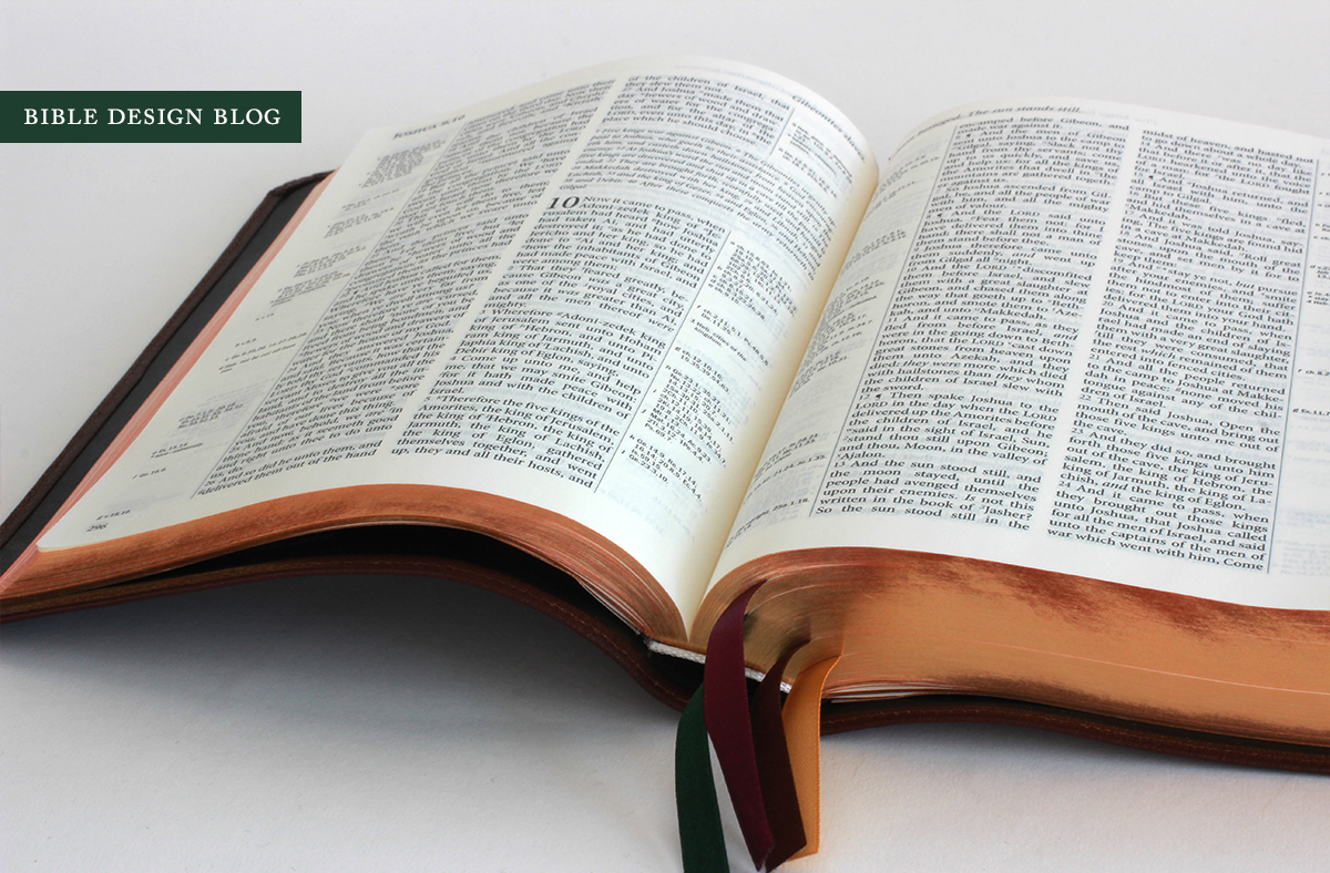
The Jongbloed hinge I wrote about in my piece on the Crossway Heirloom Single Column Legacy is an issue here, too, preventing the Bible from laying perfectly flat. As with the Heirloom, though, the book block is weighty enough that, with some use, the problem becomes less pronounced. Another aesthetic miscue is the black lining, which doesn't really go with the brown cover. My beloved Pitt Minion had the same problem, which used to be ubiquitous when color came back to the world of Bible covers. Now it's standard for the lining to match or compliment the outer cover; I'm not sure what happened here.
Otherwise everything's as you would expect: glorious. The lovely art-gilt page edges, four thick ribbons to mark your place: in pale gold, brown, forest green, and purple. The 32gsm paper is a good compromise between opacity and thickness, especially when the line-matching is on (though it isn't always in my review copy). Schuyler has done a great job, as always, in rendering the TBS Westminster Bible in as high quality an edition as possible. The results speak for themselves.
The Antique Mahogany cover pictured here is being replaced by the Brown Marble cover familiar from the Schuyler NKJV, which shows a bit more color variation depending on the light. The photo below illustrates the difference if you compare the Antique Mahogany (top) to the Brown Marble (second from top). Personally, I prefer the Brown Marble because I'm a sucker for that subtle ripple effect. The casual observer might not be able to tell much difference between the two. Both shades are on the lighter end of the dark brown spectrum, not quite in the realm of mid-browns like the calfskin Clarions, but certainly brighter than the chocolate goatskins from R. L. Allan, and the deep brown of the new Crossway Heirloom Single Column Legacy.
This edition has been a strong seller for Schuyler -- no wonder the Antique Mahogany editions are all gone! -- which goes to show that there's a huge market out there for traditionalist KJVs with updated typography. That description doesn't really go far enough to capture the Westminster Bible, though. When you read through the front matter and use this edition for awhile, it begins to feel like an attempt to preserve an older way of seeing and using Scripture. For many fans of the translation, the late 18th century is really the apotheosis. The final form of the text is arrived at, and the apparatus is more or less perfected. Despite its thoughtful refinements, this is essentially the Bible as you might have experienced it at the height of the Enlightenment. Whereas an edition like the Clarion makes the translation more accessible by making it more readable, more like the books we're accustomed to spending time with, the Westminster could be seen as an effort to make the reference KJV of yesteryear as accessible as possible without changing its essential form. If you're worried about losing not just the KJV but the older way of making use of it, a Bible like this speaks to you on a very deep level.
Schuyler offers the Bible in a variety of colors ranging in price from $185-$195. You can discover all the options and order a KJV Schuyler Reference Bible of your own by visiting our friends at EvangelicalBible.com.


