Writing In Your Bible: The Schuyler Canterbury and the Case for Traditional Wide Margin Bibles
In a market packed with Bibles designed for recording both the thoughts and the artistic expressions inspired by your reading, is there still a place for traditional wide margin editions? Now that the Schuyler Canterbury KJV is being offered in this old school format, it’s time to ask whether there is a case for these classic note-taking Bibles.
But first things first: should we be writing in our Bibles in the first place? Believe it or not, one of my earliest Bible-related rants was not, as you might expect, about the need for more readable editions. Instead, it was a love letter to wide margin editions. That ought to give you a clue about which side of the line I’m on. When it comes to the question of whether people should be writing in their Bibles, my answer is a full-throated: “Yeeesss!” And yet, a surprising number of my readers, both through e-mail and in person, have told me they would never dream of doing that.
Above: As a lover of traditional wide margin editions, I am convinced of their continued relevance, even in a market flush with innovative new formats that promote journaling and even artistic expression in the margins of the text — the new generation of illuminated manuscripts.
What’s Wrong With Writing In Bibles?
There’s a school of thought that says writing in any book is bad, let alone the Bible. While I’m not on board with the sentiment, I can respect its austere purity. Books deserve utmost respect. I loaned a favorite hardcover novel to a friend, who produced it months later from her overstuffed purse, returning it with a rickety binding and tattered dust jacket and not a trace of embarrassment: That’s just what books look like once they’ve been read. Well, not in my world. That happened in 1992. I still have the book, and I still haven’t recovered. So, sure, I get it. You don’t write in your Bible because it’s a book, and you don’t write in books. Fair enough.
But most of you are happy to write in ordinary books, just not your Bible. In a few cases, the concern is sacrilege. Jotting your notes in the margin feels too much like adding to the Word. For the vast majority of the non-annotators I meet, the objection isn’t religious; it’s economic. Your Bible is too nice a book to risk defacing with your primitive scrawl. And by “too nice” I mean too expensive. There is a strong correlation between this group and the ones who carry their edge-lined goatskin editions to church in the original clamshell box. (Don’t do it!)
Times are changing, though. The good news is, we’re writing in Bibles again. Not all of us, of course. And the Bibles we are writing in now aren’t the same ones as before. They are not the wide margins of old that I once ranted over.
In ancient days, the ideal format for those of us who annotate our Bibles was the wide margin edition. These oversized books featured the small-print scriptural text at the center of the page, bordered on all sides by snowy white extended margins. In every other respect—the thin paper, the leather binding, the aesthetics—they resembled standard editions. It was as if the printer had forgotten to trim the pages down to size, which left a generous blank field for the reader to fill with personal jottings. This is what I wanted to see more of back in the day.
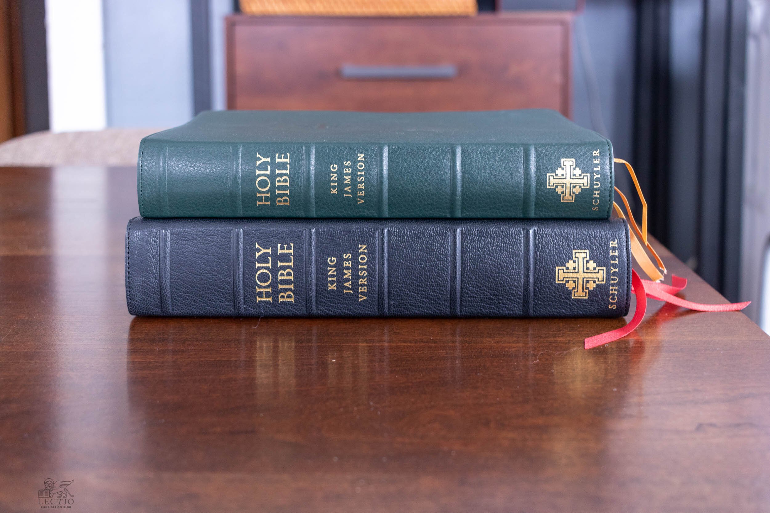
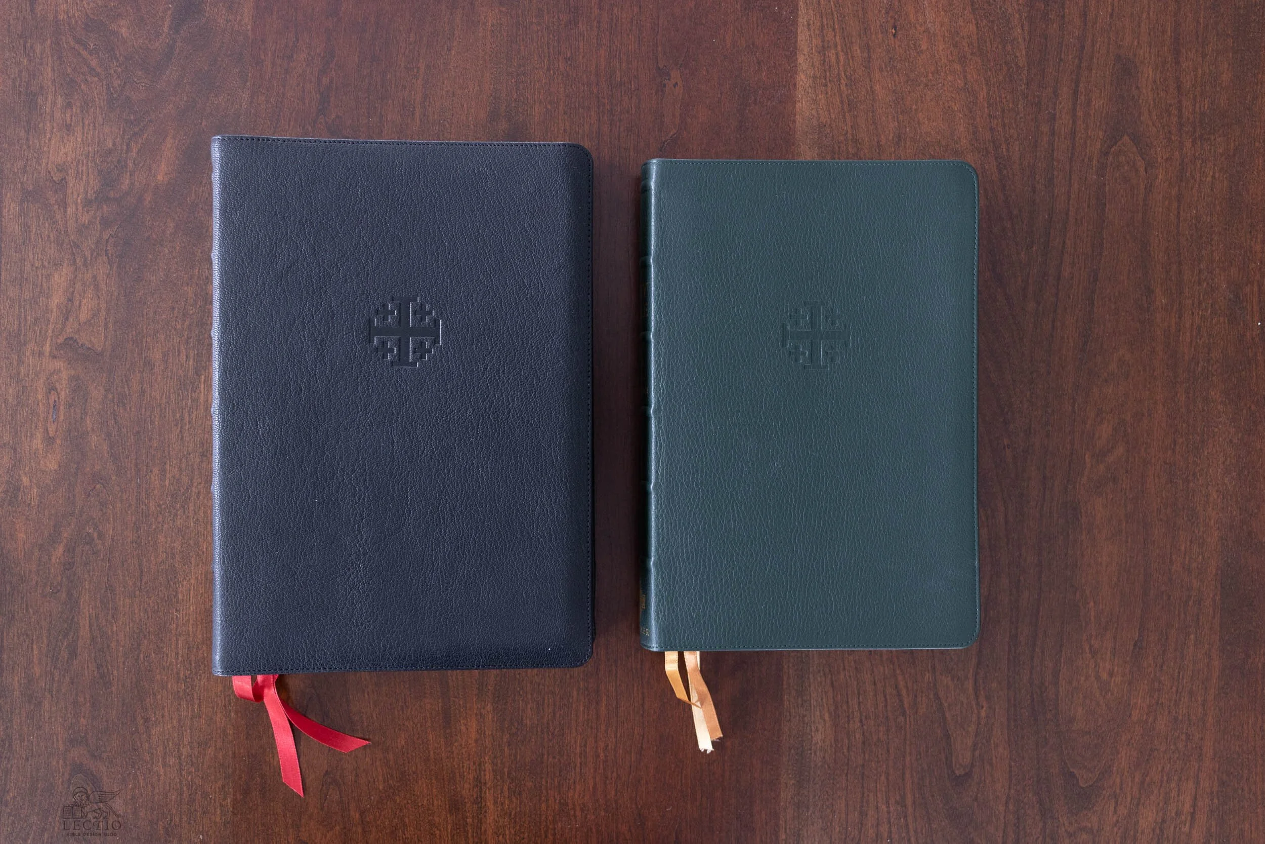
Above: Compared to the original Schuyler Canterbury KJV, the new wide margin is larger and shrinks the type size down considerably. But for that trade, you gain generous room for note-taking on the outer, upper, lower, and even inner margins.
The revival of interest in quality Bibles over the past decade or so has not left wide margins behind. Cambridge started making wide margins with fabulously limp edge-lined bindings. The popularity of these mouthwateringly liquid books breathed new life into the format. Then something unexpected happened, something that went on to change the landscape. Crossway introduced the journaling Bible concept, and somehow that cross-pollinated with the scrapbooking subculture to create a whole different genre. There’s been an explosion of inexpensive new editions designed not just to be written in but also drawn in. In a sense, illuminated manuscripts are back. It’s not unusual to see spreads from someone’s Bible not just annotated but illustrated. I’ve seen pages covered with multi-color mind-maps, and I’ve seen pages laden with Instagrammy inspirational swirls.
“Don’t you hate that?” a few curmudgeons have asked. And not without reason. A contrarian by birth and training, I tend to take a dim view of anything popular on principle. Groucho Marx in Horse Feathers has nothing on me: whatever it is, I’m against it. But not in this case. I would rather see Bibles—especially “nice” ones—being used and abused than kept behind the velvet rope as art objects.
Above: Like all Jongbloed edge-lined bindings, the Canterbury wide margin is the epitome of limp flexibility, liquid in your hands. The only thing preventing it from opening flat is the stiff hinge connecting book block to cover.
But, of course, people don’t use nice Bibles for this sort of thing. They naturally gravitate toward the ones printed with this kind of use in mind. I am particularly fond of the series from featuring portions of Scripture printed “Blank Bible”-style, with the scripture text on one side and the facing page lined for notes. These are great for following along in a Bible study or sermon series. I gave my wife one of these booklets when I began preaching through the Epistle to the Romans at the beginning of the year. Eight chapters later, it is bursting with notes—which highlights another reason people don’t use nice wide margins for this sort of thing. There simply isn’t enough room. If a whole page side-by-side with a a few regular-print paragraphs of text is insufficient for note-taking, then a 1.5 inch margin alongside a fine-print column doesn’t even come close.
This observation brings me, finally, to the point. Is there a logical use any longer for a traditional wide margin edition?
The Canterbury Wide Margin
When Schuyler introduced its Canterbury KJV in 2016, I noted that it was aimed at a very particular niche. The Canterbury puts modern design in service to nostalgia. It is the King James Version you imagine existed in the golden age, but really didn’t—sharp and readable, but with a nod to aesthetic embellishment. (I won’t repeat my observations here; you can click on the link and get all the details.)
Now the Canterbury has re-emerged in a classic wide margin edition. The type has been scaled down to accommodate the extra room around the edges. The original 11 pt Milo type has been reduced to 9.5 pt, which is still a bit larger than the 8.5 pt type in the handy Personal Size Canterbury. The wide margin drops the self-pronouncing feature, but adds red-letter text. Personally, I dislike both practices. They make sense, though, within the logic of the Canterbury, and the execution of the red lettering is excellent. In every other respect, the wide margin shares the DNA of the original—the same high quality printing, the beautiful leather cover options, the gorgeous gilt edges.
My only gripe with the binding is something I have lamented in the past: the over-stiff hinge point connecting book block to cover, which prevents this limp binding from actually opening flat. I’m sure the rationale had to do with durability. Filling a wide margin Bible is a lifetime commitment, so you want the cover to hold up. I would rather the book open flat, but I understand the concern.
Above: The dreaded “hinge” is the stiff tab where the end papers and the book block come together. As you can see in these images, that narrow strip of defiance prevents the book from opening flat. On the other hand, it’s built like a tank and should allay any fears concerning durability.
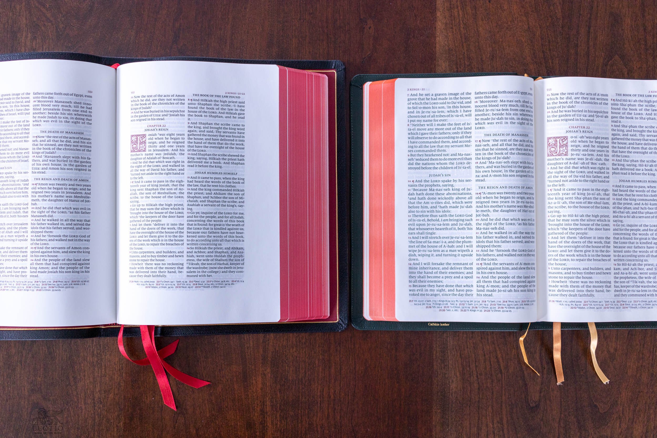
Because of the Canterbury’s traditional double-column layout, the wide margin edition faces a special challenge. If you only expand the outer margin of a two-column layout, the reader cannot easily annotate the inside column. Common sense dictates that a wide margin edition with a double-column layout must have extra room on both sides of the text. Even so, a lot of publishers get this wrong. Fortunately, Schuyler is not one of them. The Canterbury’s outer margin is 1.25” wide, and the inner margin is roughly the same, though because of the gutter you lose at least an eighth of an inch worth of usable space. You get about an inch up top, and 1.25” inches at the bottom of each page. This looks like a lot of white space when you open to a blank spread, but depending on the size of your handwriting and how you use it, the room can fill up quickly.
Above: A traditional double-column layout (left) faces a challenge in comparison to a single-column setting like Crossway’s Heirloom Legacy ESV (right). The inside column necessitates extra white space on the inner margin, at the gutter. The Canterbury allows almost as much room here as it does in the outer margin, though the gutter makes it less accessible for writing.
The review copy pictured here is bound in black goatskin with all the standard Schuyler touches, including raised bands on the spine, a gilded line around the inner perimeter of the cover, a regal blood red leather lining, and art-gilt page edges. It comes with three red ribbons. Up front, you get traditional presentation pages and “The Translators to the Reader,” the essential preface to the King James Version. In back, there is a fine-print concordance, lined notepaper (in two-column format), and a high quality set of maps. Printed and bound by Jongbloed in the Netherlands, this edition bears all the hallmarks of craftsmanship we have come to expect from Schuyler.
Above: The fine details that come standard on Schuyler editions set a consistent standard for quality that is, frankly, unrivaled. And just look at the glassy sheen of that Jerusalem Cross imprint against the grain of black goatskin leather.
The real question is, how do you make use of such a Bible? The paper is still the thin, temperamental stuff that quality editions are always printed on. While a wide margin is made to be written in, you can’t exactly write with abandon. Some care is required. Treat these pages the way you would an entry-level journaling Bible and you will make a mess of things. Ink bleeds through when you write, so don’t even think about drawing. And yet, things are not all as bad as that. With a little thought, I believe we can find a use for traditional wide margins even in this moment of illuminated journaling. In fact, I’m as sold on the format today as I was when I started writing about Bibles years ago.
Testing Your Tools
With the Canterbury wide margin, I did what I always do: conducted a series of tests. I wanted to find out what I could get away with on the page, then dial it back to optimal. This is what you need to do with any Bible you intend to write in. Start with non-essential pages—the concordance is a great choice—and see what happens when you underline and make notes. If the writing bleeds through, go for a thinner pen, or switch from pen to pencil. Because this is thin paper, there is no avoiding show-through—what you write will be visible on the reverse side of the page, and probably for several pages—but try to avoid bleed-through, which is when the ink actually penetrates the paper.
Above: These two images illustrate the results of writing in the Canterbury with a Pigma Micron 0.45 mm pen. The ink seems to feather a bit on the front of the page (top), and shows through clearly on the reverse, even threatening to bleed through at points. This led me to search for better options.
I began with the gold standard recommendation for writing on Bible paper, the Pigma Micron pen. The two I had nearby were both 0.45 mm, one in blue and one in olive. Surprisingly, they had a tendency to feather slightly on the Canterbury paper. Instead of a sharp, thin line, the letters looked thick and fuzzy at the edges. (Others have experienced great results with the Pigma Microns, so the problem could be these particular pens. Maybe different color inks behave differently, too.) I also noticed that the Pigma Micron was bleeding through at points. So I had to scale down. Over the summer, I visited the Japanese bookstore across from Bryant Park in Manhattan, leaving with a fistful of Uni-ball Signo pens. I tried a green 0.28 mm Signo on the Canterbury and it worked well. My heavy touch left an impression on the page which you could feel by running your fingertip over the reverse side, but the ink did not bleed through. I have always had good luck with ballpoints and Fisher Space Pens, too. Rule of thumb with Bible paper: ‘dry’ writing implements fare better than wet.
But honestly, take a page from the cosmonaut handbook and try using pencil for a change. After years experimenting to find the best pen to write on Bible paper with, I finally took some advice from a reader and sharpened myself a pencil. It wasn’t easy. I still remember what a milestone it was in grade school when we were allowed to start using pens—a sign of maturity only matched when I was permitted to stop writing cursive and use block letters. Pencils are for kids, I told myself. The fact is, we are living in a bit of a pencil revival. There are lots of cool grown-up options out there. I’ve started using traditional wooden pencils quite a bit, and have dabbled in metal ones for convenience, too.
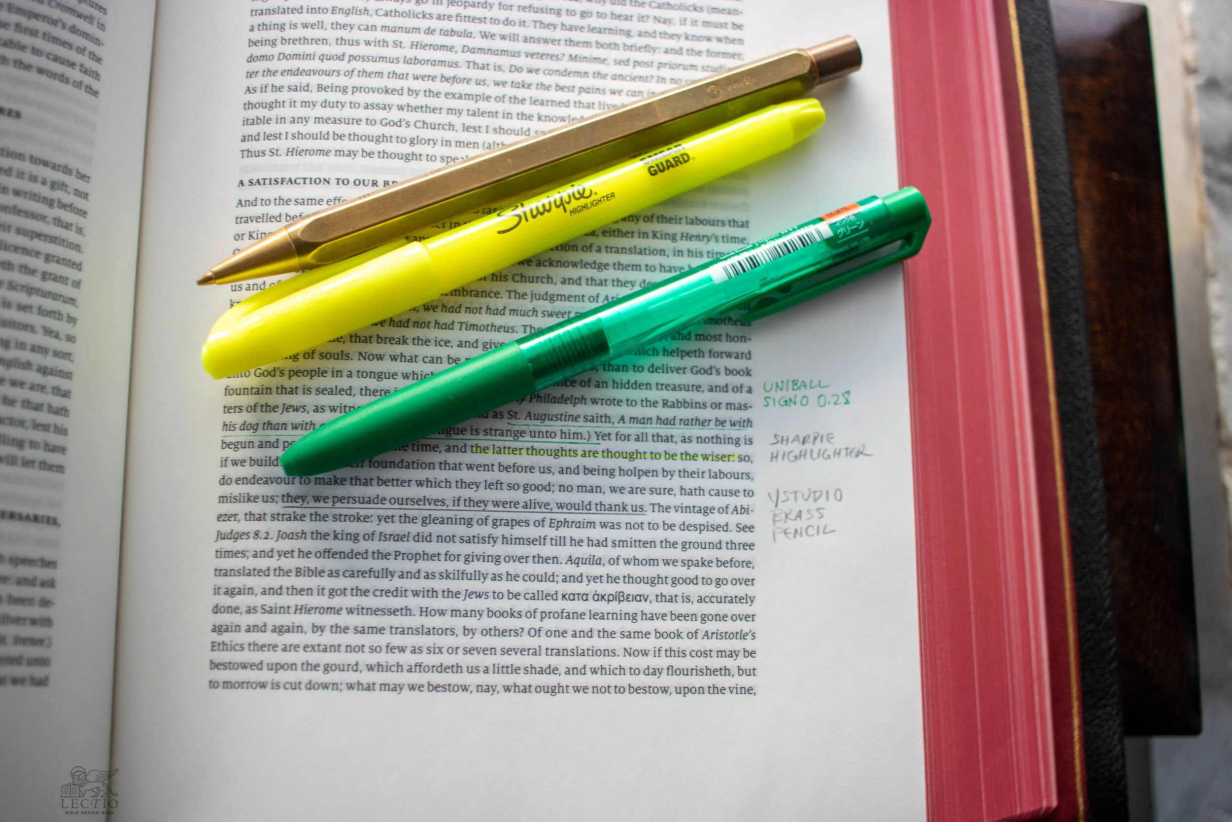
Above: When I switched to pencil, the results were better. If you can tolerate — or like me, prefer — the low contrast of graphite (top), pencil can be erased, and doesn’t run the risk of bleeding through. The reverse of the page (bottom) still manifests some show-through, especially with a heavy hand like mine. Note that at one point the highlighter bled through the page, as well.
In the Canterbury, I had success with the Caran d’Ache Swiss Wood pencils that have become my favorite. They left a sharp, clean line on the page without any anxiety about bleed-through. Even better was the Ystudio brass mechanical pencil, which is rugged enough to carry anywhere, its delicate point just a click away. Pencil lead comes in different colors, too. You can load up a mechanical pencil with red, for example, if you want some contrast. Personally, I prefer the lower contrast of pencil against black ink. The notations are there when you look for them, but they don’t stand out as much.
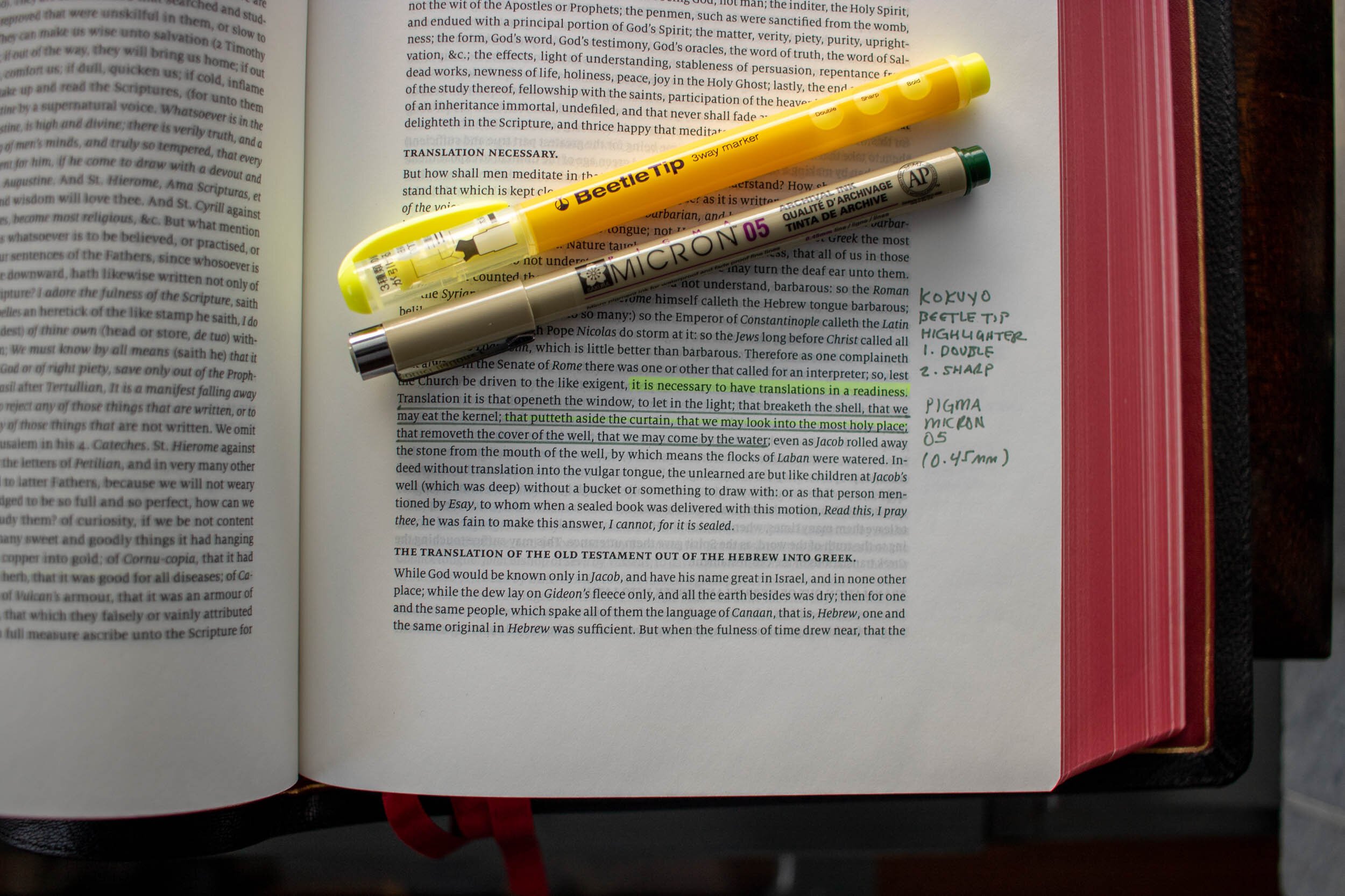
When it comes to highlighters, I recommend starting with this tutorial from Jet Pens. They recommend either pencils or the Kokuyo Beetle Tip 3-Way highlighter. I happened to have a Caran d’Ache Fluo highlighter pencil, and that worked well with the Canterbury. The fine tip on the Beetle was excellent, too. As you can see in the photos, the accent is subtle. Some people like to paint radioactive highlights on the page, but I hate that crinkly mess and try to keep things as gentle on the eye as possible. I’ve been using Sharpie highlighters a lot in regular books, and decided to try one on the Canterbury. By using only the tip, I made a fine accent that did not bleed through the page.
Above: These three images illustrate the writing combinations I tested. The Caran d’Ache pencils (left) were perfect for the job. The Beetle Tip highlighter recommended by Jet Pens (center) worked well using the finest point, but I had disappointing results with the Pigma Micron. The brass Ystudio pencil did well (right), and so did the Uni-ball Signo with 0.28 mm point. Even the Sharpie worked, provided I used the thin edge and didn’t press too hard. Note that this testing was done in the preface, “The Translators to the Reader.” Always test in a section of the book where failures won’t haunt you later!
As I mentioned, though, everything shows through the page. This is the tradeoff you have to make peace with. If you write on both sides of the same page, it’s going to get a bit untidy. If, like me, you err on the side of fastidiousness, just take a deep breath and remind yourself that utility is the key.
The question remains, if I can’t draw in it, and I have to be so careful writing in it, what is the value of one of these traditional wide margins? It’s not designed for “illuminating,” so what do I do with it?
The Best Use of Traditional Wide Margins
First, there are a couple of uses that might seem optimal but really aren’t. I’ve already mentioned note-taking. The reality is, if you’re trying to take detailed notes on your reading, you will have to use a dedicated notebook. The margins will only accommodate so much. Stream-of-consciousness reactions to each verse will fill the page in no time. You also won’t find a wide margin edition particularly good for holding, say, sermon outlines. I have tried to make this work, and while I’m sure there are some minimalists who can manage, my outlines are simply too detailed to fit. If you can make do with a bare-bones outline, it could work.
Having said all this, consider where the traditional wide margin really shines. That extra inch, inch and a half of margin is perfect for flagging the main points in what you’re reading, for emphasizing quotes you want to remember, for recording connections within your reading that were not handed to you by the cross-references. In other words, it is perfect for the kind of marginalia that accompany the engaged reading and processing of any text—the stuff you do with any book you happen to be studying. Sure, you may have to take detailed journaling or artwork to a separate volume, but this rough and ready marginal mark-up goes wherever your Bible does, always there to jog a memory, spark a connection, or orient you at a moment’s notice within a familiar text.
The traditional wide margin is a wonderful companion for Bible study, too. Years ago, I took a group of college students line-by-line through the Pauline Epistles. To prepare before class, I would read and annotate the text in my Cambridge wide margin, marking the broad strokes of the chapter, noting any details I wanted to be sure not to miss in the back-and-forth of conversation. This works whether you’re the teacher or the participant. Imagine a group discussion where, instead of taking turns reading aloud the notes from their study Bibles or the fill-in-the-blank responses from a workbook, participants relied on the notes they made while reading and processing the text before class. This can be done without a wide margin Bible, of course. But using one sure makes it easy.
The advantage of the traditional format over the newer ones is that the wide margin still feels like your main Bible. It contains the entire library of Scripture in one volume, it’s usable, durable, and quite attractive. It is a specialized edition that retains the familiar hallmarks, a specialized edition that is not so specialized that it cannot be used as an ordinary everyday Bible.
Purchasing the Canterbury Wide Margin
Considering the mashup of modernity and nostalgia the Schuyler Canterbury exemplifies, making this layout available as a wide margin makes a lot of sense. The reader who wants an old school King James Bible with all the contemporary mod cons will love this wide margin option, which, after all, lends itself to a very old school approach to reading and studying Scripture.
You can purchase the Schuyer Canterbury KJV Wide Margin from EvangelicalBible.com by following this link. As of publication date, the list price for editions bound in goatskin was $230. There is also a calfskin edition available in black, with a current list price of $175.

